Accessible dial button
Published on Tuesday, April 25, 2023
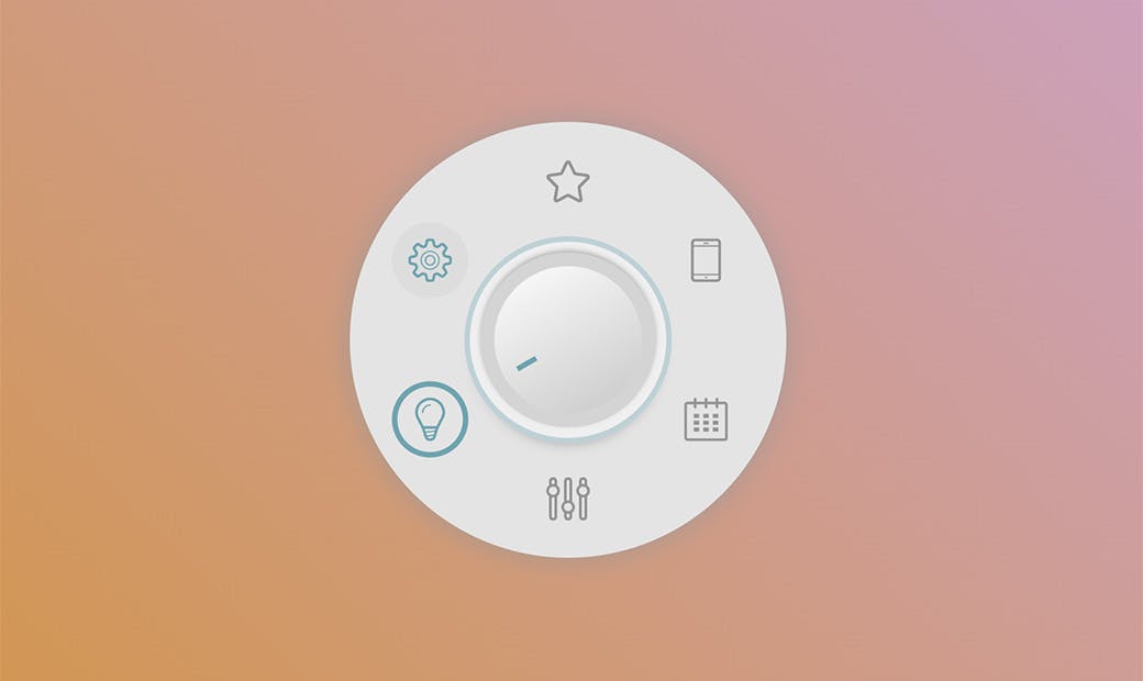
For this experiment I tried to replicate a dial button created by Joshua Guo: the concept is a sort of circular menu opened by a central knob with a transition. When the menu is opened, all menu items animate around the circumference until they reach their final position.
Here you can see the full demo currently working only on Chrome.
To create the animation I used just CSS, while I added some event listeners in javascript to make the menu more accessible. Here below I'll show the most important steps to explain how it works.
First, I registered a CSS property with @property so that I could have continuous animation of the menu items (and not an immediate jump, from start to end position).
/* register the --angle property to make it animatable */
@property --angle {
   syntax: '<angle>';
   initial-value: -90deg;
   inherits: true;
}
(This syntax is part of the Houdini API).
The main container is a 3x3 grid element, where the central cell is fit with the knob.
.dialbtt {
   display: grid;
   grid-template: 6rem 8rem 6rem / 6rem 8rem 6rem;
   place-content: center;
   margin: 1rem auto;
}
...
/* this is the knob style */
   .dialbtt__knob {
     position: relative;
     z-index: 1;
     grid-area: 2 / 2 / 3 / 3 ;
     ...
}
The shadow below the knob must remain in that position even when it rotates to point the selected menu item, so it must be absolute positioned through a pseudoelement of the button.
With a second pseudoelement I also created the indicator showing the orientation of the knob:
.dialbtt__knob {
  &::before, &::after {
    content: "";
    position: absolute;
    inset: 0;
  }
  /* background of the knob: this should always be darker at
   * the bottom, even when it is rotated. So it has been
   * placed in an absolute pseudoelement.
   */
  &::before {
    background-image: linear-gradient(
        150deg, var(--knob-grad1), var(--knob-grad2));
  }

  /* dark line over the knob.
   * this is what is actually rotating
   */
  &::after {
    padding: 10% calc(50% - 2px) calc(90% - 1rem);
    background-clip: content-box;
    background-image: linear-gradient(
       var(--knob-color), var(--knob-color));
    rotate: var(--knob-rotation, 0deg);
    transition: rotate .5s;
  }

  ...
}
The list that appears when you click on the central button fills the entire grid but in the initial state it is hidden thanks to a 50% margin:
.dialbtt__list {
     position: relative;
     grid area: 1 / 1 / 4 / 4;
     margin: var(--margin); /* =50% initial state */
     border-radius: 50%;
     ...
}
This is the most interesting part of the demo: the basic trigonometric functions in CSS are now supported by all the latest versions of the major vendors so I used them to rotate the menu icons around the circumference of the container:
li {
   --angle: -90deg;
   --size: 3em;
   /* trigonometry in CSS is rad! */
   translate: calc(7.3em * cos(var(--angle)))
              calc(7.3em * sin(var(--angle)));
   ...
}
Finally, all the animations depend on the state of the aria-expanded attribute of the open/close button. What is changing is just the value of the variables that control the appearance of the various elements and that determine the properties to position them correctly in the two different states.
The presence of the inert attribute needs to exclude a sub-tree from assistive technologies and to disable any interaction with actionable elements contained when the menu is closed.