A retrowave sunset in CSS
Published on Wednesday, March 29, 2023
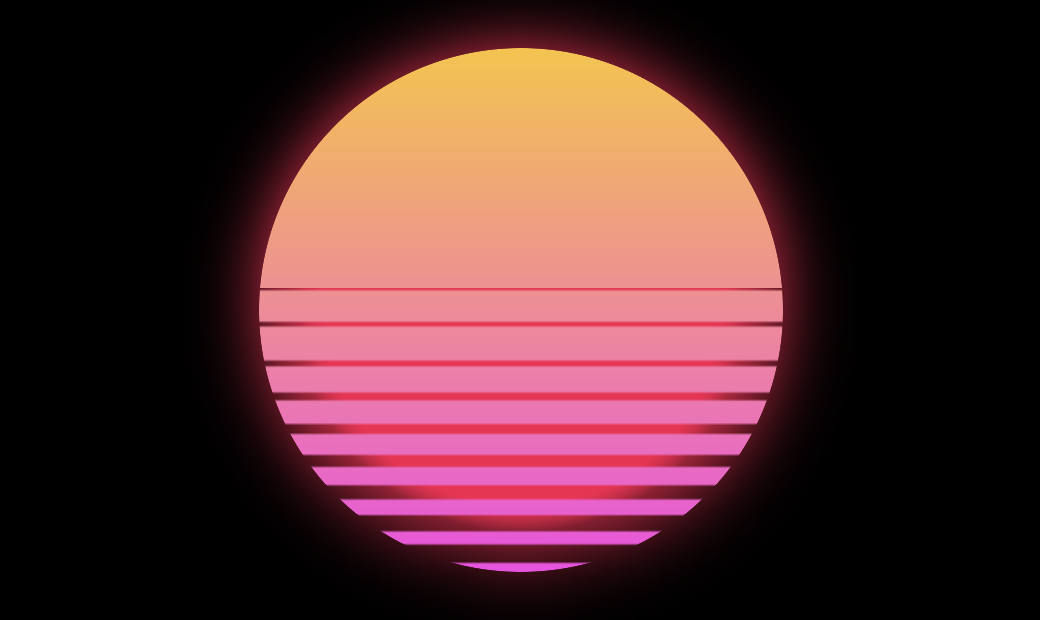
Since I like synthwave music, here is a beautiful responsive retrowave sunset, styling just one element. You can find a full Codepen demo.
For this purpose a single div is enough
<div id="sun">A retrowave sunset</div>Then we create the small purple core with a radial-background and the bigger circle using its ::after pseudoelement.
#sun {
   display: grid;
   grid-template: 1fr / 1fr;
   inline-size: min(80vmin, 400px);
   aspect-ratio: 1;
   border-radius: 50%;
   font-size: 0;

   --bg: #f9124f;
   filter: drop-shadow(0 0 min(20px, 5vmin) var(--bg));
   background: radial-gradient(
      circle at center,
      var(--bg) 0, var(--bg) 53%, transparent 60%
   );
}

#sun::after {
   content: "";
   grid-area: 1 / 1;
   background: linear-gradient(#fcc22f, #f945e5);
   border-radius: inherit;

   --mask: linear-gradient(to top,
     #000 1.5% , #0000 2%   , #0000 5%   , #000 5.5%
    ,#000 7.5% , #0000 8%   , #0000 10.6%, #000 11.1%
    ,#000 13.6%, #0000 14.1%, #0000 16.3%, #000 16.8%
    ,#000 19.8%, #0000 20.3%, #0000 22.1%, #000 22.6%
    ,#000 26.1%, #0000 26.6%, #0000 28%  , #000 28.5%
    ,#000 32.5%, #0000 33%  , #0000 34%  , #000 34.5%
    ,#000 39%  , #0000 39.5%, #0000 40.1%, #000 40.6%
    ,#000 46.6%, #0000 47.1%, #0000 47.5%, #000 48%
    ,#000 53.5%, #0000 54%  , #0000 54.2%, #000 0
   ) no-repeat;

   -webkit-mask: var(--mask);
   mask: var(--mask);
}
The mask is needed to create some gaps at the bottom, so the core behind is visible. And here is a demo of a full retrowave and animated scene.