Published on Monday, May 1, 2023
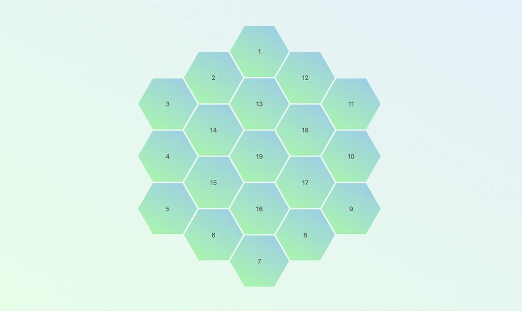
For absolutely no reason here is a hexagon full of responsive hexagons, made in CSS using Grid layout, variables and trigonometry! The magic is in this line
aspect-ratio: calc(1 / cos(30deg));(cos(30deg) ~= 0.866 is known as the fixed number for the hexagon, that is the ratio between the length of its side and its radius). Only in Safari a calc() wrapping the expression seems to be necessary to properly work.
This is the code to style the grid and the inner hexagons:
#board {
  display: grid;
  place-content: center;
  grid-template-columns: repeat(11, 1fr);
  grid-gap: .5% 4%;
  inline-size: calc(90vmin * cos(30deg));
}

.hex {
   display: grid;
   place-content: center;
   grid-area: var(--r) / var(--c) / span 2 / span 3;
   aspect-ratio: calc(1 / cos(30deg));
   clip-path: polygon(
      25%   0,    0  50%, 25% 100%,
      75% 100%, 100% 50%, 75%   0
   );
}
The grid-area of each element is controlled by just setting a couple of variables that control the starting row and column inside the grid.
.hex:nth-child(1) { --r: 1; --c: 5; }
.hex:nth-child(2) { --r: 2; --c: 3; }
.hex:nth-child(3) { --r: 3; --c: 1; }
...
.hex:nth-child(17) { --r: 6; --c: 7; }
.hex:nth-child(18) { --r: 4; --c: 7; }
.hex:nth-child(19) { --r: 5; --c: 5; }